Cohort analysis
This report lets you select groups of users (cohorts) and track metrics of completed events for the selected period of time in the cohort. You can use the report to assess the quality of traffic sources and the quality of the audience produced by media sources. Also, the report allows you to analyze how many users have completed an event in the selected cohort. In this way, you can calculate the users from a particular partner.
The report allows you to pull out certain users by defining data segments. For example, you can create a segment of users who made a purchase in a certain region. With data segments, you can also set the period of the target action for your report.
To build a report, you need to choose the time period, the audience segment, the grouping type, the cohort size (a date range such as a day, week, or month), and the event to analyze.
By default, the report shows dynamics of the "Session start" event after the app was installed (day 0), on the following day (day 1), a day later (day 2), and so on.
Grouping data
The data in the report can be grouped by:
- Installation date.
- Media source.
- Tracker and tracking URL parameters.
- Country.
- Region.
- City.
- Operating system.
- Gender.
- Age.
- App version
To exclude negligible partners, trackers, or tracking URL parameters, specify the minimum size of the cohort. This enables you to focus on the key metrics.
Metrics
Events, Users, Total Revenue, In-App Revenue, Ad Revenue, Paying users, and Purchases are available for analysis.
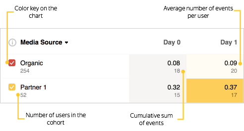
- The average number of events per user
- This metric is calculated as the ratio of the cumulative number of events on Day N to the number of users in the cohort.
- The cumulative number of events
- The metric for Day N is calculated as the sum of events for Day N and for previous days in the selected period.
The report interface also displays the following:
- The color key of metrics on the chart. Use it to show or hide a metric on the chart.
- The total number of users in the cohort.
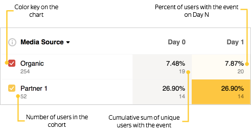
- Percentage of users who committed an event on Day N
- This metric is calculated as the ratio of the cumulative number of the unique users on Day N to the number of users in the cohort.
- The cumulative number of the unique users who committed an event on Day N
- The metric for Day N is calculated as the sum of the unique users for Day N and for previous days in the selected period. If the user has completed the event several times in the selected period, the event is counted only once.
The report interface also displays the following:
- The color key of metrics on the chart. Use it to show or hide a metric on the chart.
- The total number of users in the cohort.
Total revenue from advertising monetization, in-app purchases, and in-app subscriptions for the reporting period. Learn more about converting currencies.
- ARPU
-
This metric is calculated as the ratio of cumulative revenue on Day N to the number of users in the cohort.
- Total revenue
-
Revenue for Day N is calculated as the total revenue for Day N and previous days in the selected period.
The report interface also displays the following:
- The color key of metrics on the chart. Use it to show or hide a metric on the chart.
- The total number of users in the cohort.
Total revenue from in-app purchases and in-app subscriptions. Learn more about converting currencies.
- ARPU
-
This metric is calculated as the ratio of the total revenue on Day N to the number of users in the cohort.
- Total revenue
-
Revenue for Day N is calculated as the total revenue for Day N and previous days in the selected period.
The report interface also displays the following:
- The color key of metrics on the chart. Use it to show or hide a metric on the chart.
- The total number of users in the cohort.
Total revenue from advertising monetization for the selected period.
- ARPU
-
This metric is calculated as the ratio of the total revenue on Day N to the number of users in the cohort.
- Total revenue
-
Revenue for Day N is calculated as the total revenue for Day N and previous days in the selected period.
The report interface also displays the following:
- The color key of metrics on the chart. Use it to show or hide a metric on the chart.
- The total number of users in the cohort.
The number of users who made at least one in-app purchase or subscription during the selected period.
- Percentage of paying users
-
This metric is calculated as the ratio of the number of paying users on Day N to the number of users in the cohort.
- Number of paying users
-
The number of paying users for Day N and for previous days in the selected period.
The report interface also displays the following:
- The color key of metrics on the chart. Use it to show or hide a metric on the chart.
- The total number of users in the cohort.
The number of in-app purchases and subscription events with positive revenue.
- Purchases per user
-
The metric is calculated as the ratio of the number of purchases on Day N to the number of users in the cohort.
- Number of purchases
-
The number of purchases for Day N and previous days in the selected period.
The report interface also displays the following:
- The color key of metrics on the chart. Use it to show or hide a metric on the chart.
- The total number of users in the cohort.
Data export
You can export data by choosing an item from the Export dropdown list above the chart. The data is exported based on the selected report settings: segmentation, grouping, and time period.
The dropdown list contains the following elements:
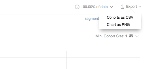
- Cohorts as CSV — Exports the data from the table in the CSV format.
- Chart as PNG — Exports the chart image in the PNG format.