Correct display
Item 1.10 of the Game Requirements
The game is displayed correctly, including during window resizing:
-
The active area doesn't go beyond the screen area. No elements are cut off.
-
Browser page scrolling (using the system scroll bar) or swipe-to-refresh is not available. With that said, you can implement your own content scrolling in the game.
-
Internal elements and texts don't overlap or cover other elements.
-
It's possible to control the game with one hand and stay in the main scene without additional scrolling or swiping. The internal playing area may be moved in strategy games, RPGs, and other genres that feature a large playing area.
Cropping and overlapping
To meet the requirement, the two following conditions must be met:
- All important elements are visible so that the meaning of each of them is clear.
- All elements are convenient to use.
1.10.1. If an element is cut off by the borders of the playing area, this shouldn't affect its clarity and usability. That is, the cropping should be insignificant. If the cropping is critical, and the element's purpose is not evident or it is inconvenient or impossible to use, moderators will deny the app publication or remove it from the catalog.
1.10.3. Elements may be slightly overlapped if this doesn't affect the user's perception of either element or their ability to interact with it. If a significant area of an element is overlapped, or the overlap makes it difficult to recognize an element or interact with it, the game will be denied publication.
The following elements can't be overlapped or cropped:
- Buttons.
- Texts.
- Significant elements, such as game objects, obstacles, scales, or indicators.
- Ad notices.
All these elements must be clear, visible, and easily readable on all of the stated platforms and in different resolutions.
Tip
You can check the game for compliance with these requirements yourself. To do so, open the app on different devices: in windows of various sizes on a laptop or desktop, in landscape and portrait orientations on a phone. To check the mobile version of the app without a phone, use the developer tools in a desktop browser.
If you want to lock the screen orientation on the phone, do it in the developer console.
Cropping
Critical
Moderators will reject the publication of the game or remove the app from the catalog if an important UI element is critically cropped. An element is considered to be critically cropped if the cropping:
- Makes the element inconvenient to use.
- Significantly reduces the element's visibility.
- Makes it hard to understand what the element does.
- Affects the user's interaction with this element.
|
Screenshot |
Comment |
|
Cropped
Not cropped
|
In the first image, it can be seen that the playing field is cropped in the browser window, making it impossible to interact with the application. In the second picture, the game can be controlled, and all interface elements are fully visible. |
|
|
The game score is not fully visible. All scores must be clearly visible and easy to read. |
|
|
A large part of the button is cropped out, so it's hard to understand what action it triggers. |
|
|
An ad notice is cropped too much and illegible. |
|
|
The store buttons are only partially visible, and their text is unreadable. This effectively renders part of the game's content unaccessible. |
|
|
The game's main content is images, some of them are cropped too much. |
|
|
Critical buttons are only partially visible, it's not clear what two of them do. Using these buttons would be inconvenient. |
|
|
Text on the bottom button goes beyond the screen area and can't be read. |
|
|
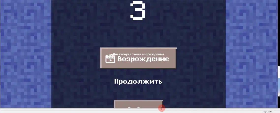
Text displayed after losing doesn't fit into the phone screen and is hard to read. |
|
|
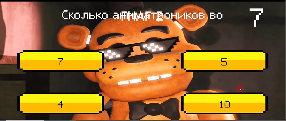
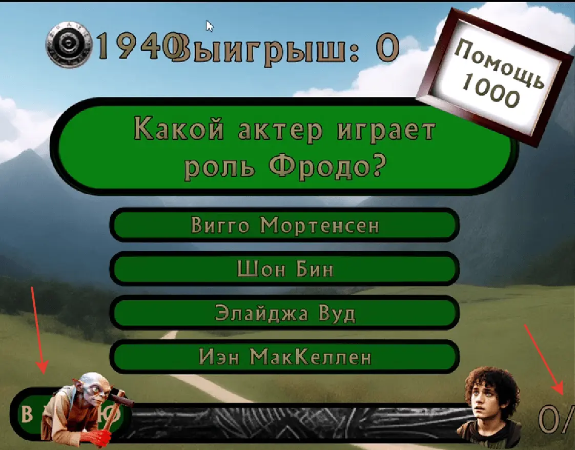
The quiz answer options are cropped too much. The very left and very right buttons are unreadable. |
|
|
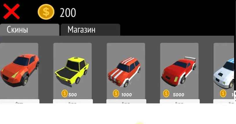
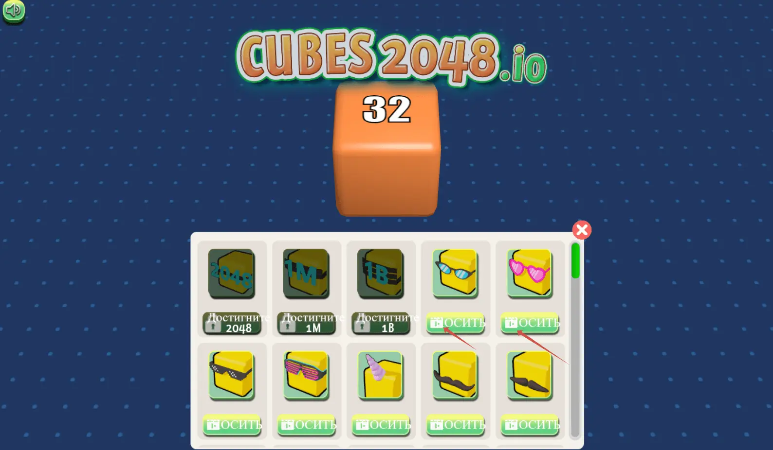
The button is heavily cropped out, and the amount of in-game resources is not visible. |
|
|
The Start button is not clearly visible. |
|
|
In visual novels, text is the most important part of the game. Here, it's cropped too much. |
|
|
The partially hidden text is a critical element in this game, but it's hard to read it. |
|
|
The timer and scores are not fully visible, one of the buttons goes beyond the screen area. |

Insignificant
If a UI element is not fully visible but is still easy to read and interact with, the cropping is considered insignificant. Moderators will still approve your game, since the cropping doesn't hinder interaction with the UI.
|
Screenshot |
Comment |
|
|
Reactions under the text are slightly cropped, but this doesn't affect their clarity and usability. |
|
|
The edges of the answer forms in this quiz are cropped, but the texts are still fully readable. |
|
|
The Start over button is slightly cropped, but a user can still easily read and click it. |
|
|
The Start over button is a critical element, but the cropping is insignificant and doesn't make the button less clear or usable. |
|
|
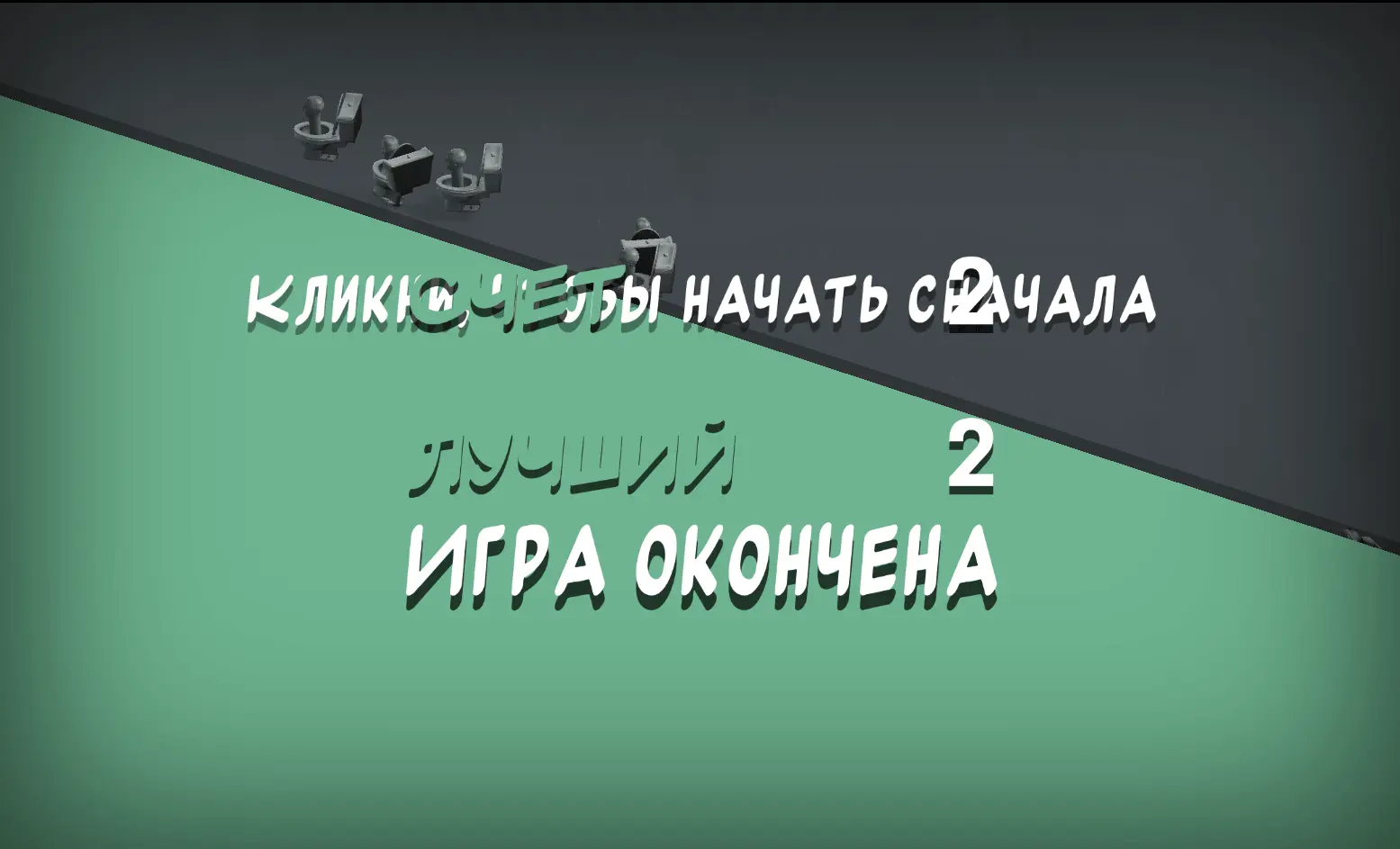
The "Game Over" text is not fully visible, but still pretty clear. |


Overlapping
Critical
Games where element overlapping hampers the user experience will be removed from the catalog or denied publication. Make sure your app is convenient to use, and all of its UI elements are clearly visible and intuitive. Otherwise, overlaps will affect the UI usability and be categorized as critical.
|
Screenshot |
Comment |
|
|
The button text is overlapped by another button and impossible to read. |
|
|
Half of the card is hidden by the score. This is an example of a critical overlap, because the card's score is not visible, and this affects the gameplay. |
|
|
The ad icon overlaps the button text and makes it too hard to read. |
|
|
The view ad button fully covers the reward description. This strongly discourages the users from viewing ads. |
|
|
Texts on the screen that appears when the player has lost overlap and are hard to read. |
|
|
The description of in-game resources and the playing area are on the same layer and against the same background. This makes it difficult to read the text and inconvenient to play. |
|
|
The quiz question text overlaps itself and becomes unreadable. In quizzes, text is the most important part of the game. |
|
|
The Menu button is overlapped in a way that makes it difficult to click. |
Insignificant
If some UI element is not fully visible, but is still clear and easy to interact with, moderators will approve the game. Overlaps should not affect how the user interacts with the interface.
|
Screenshot |
Comment |
|
|
The level buttons overlap, but their text is readable, and the overlapping doesn't affect their usability. This visual flaw is non-critical. |
|
|
Text on the Next button is partially covered, but is still clear, and you can still click the button. |
|
|
The images partially overlap, but their texts are OK, so this doesn't interfere with the gameplay. |
|
|
The settings button is partially covered, but it's still clear what the button does, and the user can easily interact with it. |
|
|
The game name and the launch button text slightly overlap, but both of them are easy to read, and it's still easy to click the button. |
Game Adaptability Check
To check the game, moderators stretch and narrow the game area vertically, horizontally, and diagonally, and scale the game on different devices. The most popular screen resolutions are used for testing.
Download PNG Images for Testing
Testing Logic
- Open the game window and fit it into a green rectangle. Its aspect ratio should be 16:9.
- Shrink the browser window by 20% along each axis (to the boundary of the red rectangle).
- Fit the browser window into the red rectangle.
If the game displays incorrectly during these actions, it will not be allowed for publication.
Testing Examples
|
Actions |
Game Field |
Comment |
|
Reduce the width of the game area. |
|
When the aspect ratio changes, buttons on the left are cut off and their labels become unreadable. |
|
Reduce the height of the game area. |
|
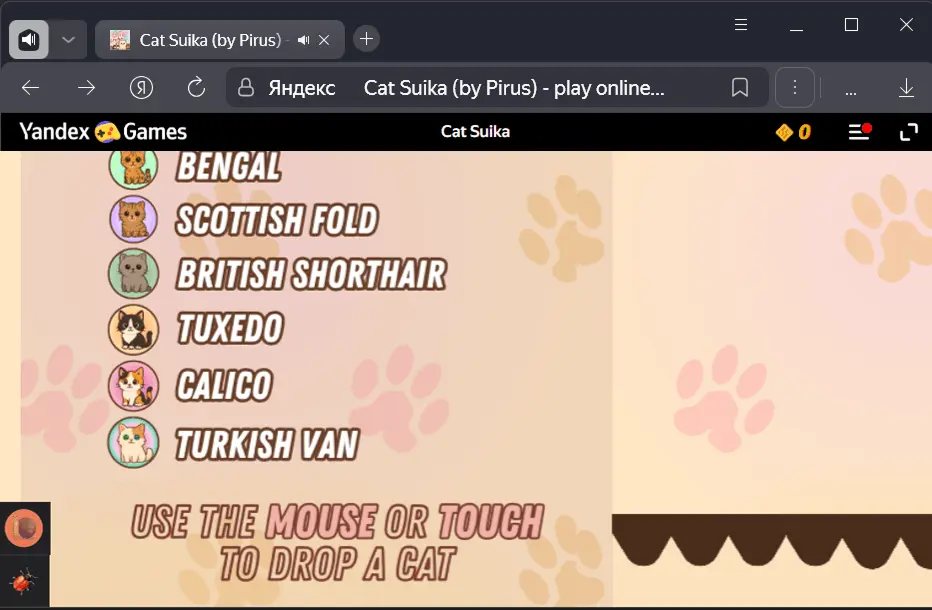
Due to the small height of the game field, not all important elements fit on the screen, and the cat's head almost completely covers the player's score. |
Scroll and Swipe-to-Refresh
1.10.2. Before submitting the game for moderation, make sure there is no system scrollbar of the browser window or swipe-to-refresh feature in the game. You can use custom scrolling within the game.
Scrolling
Warning
When checking the requirement, pay attention only to the system scrollbar.
How to distinguish scrolling:
-
Browser (system) scrolling is available from any part of the game, as it scrolls the game window itself.
-
In-game scrolling scrolls a specific element or menu within the game separately.
During the game loading, check it for the presence of scrolling:
-
On a desktop browser at zoom levels ranging from 80% to 125%. If the scrollbar appears outside of this range, it is not considered a violation.
-
On a mobile device. Note the following:
-
On mobile devices, scrolling can appear to the right of sticky banners: after exiting fullscreen mode (especially in iOS Safari), the sticky banner does not resize, resulting in a scrollbar.
-
During the game loading process, scrolling may appear when swiping. After the game fully loads, it should disappear or remain only on the sticky banner. When the sticky banner is disabled, the scrollbar should be absent.
-
Swipe-to-refresh
Having the swipe-to-refresh feature is considered a violation of the browser scrolling requirements. Ensure that this feature is disabled.
|
Game |
Reason for rejection |
|
|
The game includes the swipe-to-refresh feature. |
Contact moderators
If you believe your game has no significant visual flaws on all of the stated platforms and was removed from the catalog or denied publication by mistake, please fill out the form below.
Our Moderation Quality Control team will re-evaluate the decision and restore your game if it was unfairly banned.