Sites for mobile devices
Search engines are improving search results for mobile devices such as smartphones and tablets. Mobile users are most likely to see:
Site with adaptive design
The site adapts to the screen size and resolution. It is available at the same URL for all devices.
A site with a dynamic page layout
For viewing the site on different mobile devices, the server responds to the URL request with different versions of the HTML and CSS code.
Mobile version of the site (a subdomain)
For viewing the site from mobile devices, a separate URL is used (a subdomain, such as m.example.com, mob.example.com, and so on). To have a mobile subdomain included in mobile search, its structure must fully match that of the main domain.
Note
Yandex checks main domains and mobile subdomains for mobile device adaptability. For example, the indexing bot checks example.com/page, then redirects to m.example.com/page. If the page on the mobile subdomain passes the check, then example.com/page is considered mobile-friendly. For more details, see How does Yandex check if the site is adaptive?
General guidelines
The recommendations for webmasters below are relevant for all approaches to site adaptation.
-
Resources must be accessible for the Yandex mobile indexing robot: Mozilla/5.0 (iPhone; CPU iPhone OS 8_1 like Mac OS X) AppleWebKit/600.1.4 (KHTML, like Gecko) Version/8.0 Mobile/12B411 Safari/600.1.4 (compatible; YandexMobileBot/3.0; +http://yandex.com/bots). The robots.txt file must allow scanning CSS and Javascript that are responsible for displaying the site on mobile devices. Otherwise, the site pages might be displayed incorrectly in the search results.
-
Site pages must respond to the server with the 200 OK HTTP code. You can check the server response in Yandex Webmaster.
-
Don't use Flash, Silverlight, or Applet technologies on pages that are intended for mobile users. These technologies aren't necessarily supported on mobile devices.
Tip
For example, users can't view an interactive section of the site or videos implemented using Flash. We recommend using HTML5 to integrate content, or eliminating heavy and complex interactive elements.
-
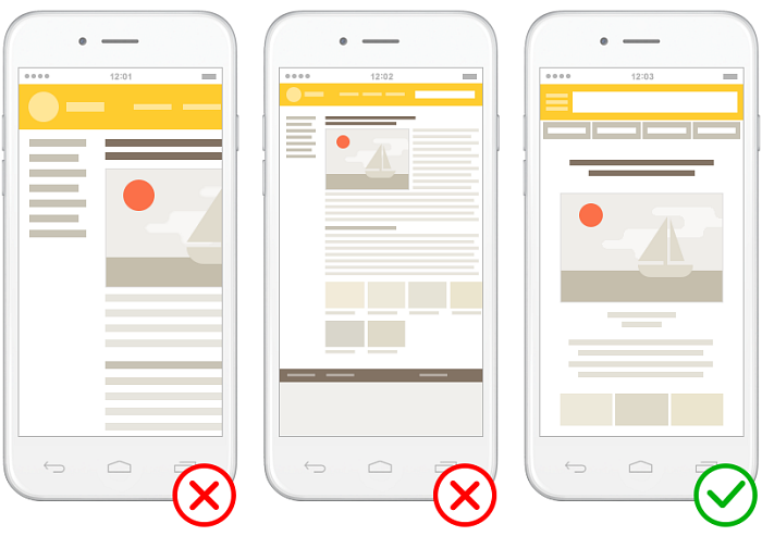
Make your site's content maximally visible on a mobile device screen.
-
The site content should fit on the screen horizontally.
-
Site pages should open correctly and without horizontal scrolls on devices with the resolution of 320 pixels or more.
-
The text size in pixels should allow the entire text to be read comfortably on a mobile device screen.
-
Addresses like
m.example.commay appear in desktop search as links to the mobile version of the site that accidentally appeared in the results. To avoid this, we recommend using less ambiguous subdomains for desktop versions, such asmos.example.comfor the Moscow version of the site.
Also see How does Yandex check if the site is adaptive?
How do I check my site's mobile pages?
To check:
- Go to Audit pages for mobile compatibility.
- Choose the site with the page you need to check from the list.
- Enter the page URL in the field. By default, the home page of the site is specified.
- Click the Check button.
The check takes a few minutes.
- Go to the Everything that Yandex Webmaster checks page.
- Choose the site with the page you need to check from the list.
- In the Recommendations section, find the line The site is not optimized for mobile devices and click Check.
The check will be completed within two weeks.
Note
The line The site is not optimized for mobile devices is not displayed when checking an alternate site address.
When using a subdomain, if the main domain is verified, the subdomain is considered mobile-friendly.
After the check is completed, the Website optimization → Site diagnostics page will display optimization recommendations. Yandex Webmaster regularly checks your site. You can configure notifications of check results.
How does Yandex check if the site is adaptive?
Yandex strives to show the mobile version of the site in search results on mobile devices. At the same time, it must be sure that the mobile and desktop versions belong to the same site. The Yandex mobile robot tests the site's main page and some of the internal pages, selecting them automatically.
If the check is successful, the site version is substituted in the mobile search results: instead of the desktop version’s address, the mobile version’s address is displayed, as it is more convenient for mobile users.
If the versions are not linked, both of them can be indexed and appear in the mobile search results, and users may see both the desktop and the mobile versions. The audience will be distributed between them, as will the signals affecting the site’s search status. When Search lacks reliable data on the connection between mobile and desktop pages, it is difficult to combine signals about them.
If the site only has a mobile version, it will be indexed the usual way and ranked in mobile search results according to general principles.
To form search results on mobile devices, the Yandex indexing bot compares the URLs of the desktop and mobile versions of the site:
|
Site settings |
Behavior in search results on mobile devices |
Recommendation |
|
The addresses of the desktop and mobile versions of the site are identical. |
The mobile version is displayed. |
|
|
The addresses differ only by domain (e.g., To indicate the mobile version on the desktop version, you can set a redirect and the |
The bot checks for the presence of a redirect from the desktop to the mobile version and the presence of the rel="alternate" attribute on the desktop version’s pages, as well as whether the redirect matches the attribute’s content. If they match, the mobile version will be displayed in search results. If not, substitution will not occur. The desktop version will be displayed in search results. At the same time, a notification will appear in Yandex Webmaster that the site is not recognized as mobile-friendly. When addresses are identical except for the domain ( |
|
Example of using the rel="alternate" attribute
-
The
rel="alternate"attribute pointing to the mobile version helps Yandex’s mobile bot understand which version to switch to. Place the attribute in thelinkelement inside theheadelement. For example:<link rel="alternate" media="only screen and (max-width: 640px)" href="http://m.example.com/" />The CSS media query string is used as value of the
mediaattribute. This string determines conditions under which the mobile robot selects the alternate URL. The value from the example is usually used when the condition is to display the page on a mobile device.
Questions and answers about mobile sites
Can the content of the mobile site version differ from the main version?
You can optimize the content of the site pages for mobile search. For example, you can leave only the content that will be useful for the users of mobile devices. At the same time, the mobile pages' content shouldn't be dramatically different from the content of the main version.
How can I avoid duplicate content?
The Yandex mobile robot considers the site's main and mobile versions as two different sites, so they are indexed separately.
To help the mobile robot identify the site version correctly, specify the URLs of the mobile pages on the corresponding pages of the main site. For example, using the rel="alternate" attribute in the link element:
<link rel="alternate" media="only screen and (max-width: 640px)" href="http://m.example.com/page.html"/>
Should I set up a redirect to the mobile version of the site?
You can redirect the user from the main site to the mobile version, depending on the User-agent of the device from which the user browses the site.
Do I need to add the site's mobile version to Yandex Webmaster?
You can add the mobile version of your site to Yandex Webmaster to track the page indexing statistics.
Note
Yandex checks the main domain and mobile subdomain for mobile device adaptability. For example, the indexing bot checks example.com/page, then redirects to m.example.com/page. If the page on the mobile subdomain passes the check, then example.com/page is considered mobile-friendly. For more details, see How does Yandex check if the site is adaptive?
Can I create a mobile version of the site in a subdirectory (folder)?
You can. For the indexing bot to link the desktop and mobile versions of the site, set up a redirect and the rel="alternate" attribute to point to the mobile version’s pages on all pages of the desktop version. Keep it in mind that the redirect from each desktop page should lead to the corresponding mobile page.
If this is not possible, use adaptive design or dynamic layout.
How do I tell the Yandex robot that the adaptive site version is available?
For sites with adaptive design, use the <meta name="viewport" content="width=device-width, initial-scale=1"> meta tag to specify the viewport. For more information, see the Using HTML tags section.
The mobile version on a subdomain has become an alternate address of the primary version
This may happen if the content of the mobile and main versions is identical. This doesn't affect the site's recognition as mobile compatible and the display of the mobile version in mobile search.
Learn more
|
Useful tools |
Services |
|
Technologies |
Mozilla/5.0 (iPhone; CPU iPhone OS 8_1 like Mac OS X) AppleWebKit/600.1.4 (KHTML, like Gecko) Version/8.0 Mobile/12B411 Safari/600.1.4 (compatible; YandexMobileBot/3.0; +http://yandex.com/bots)
Purpose of the robot
The main indexing robot.
Takes into account the General rules specified in robots.txt
Yes