Display advertising on Yandex services
Banner on Yandex services
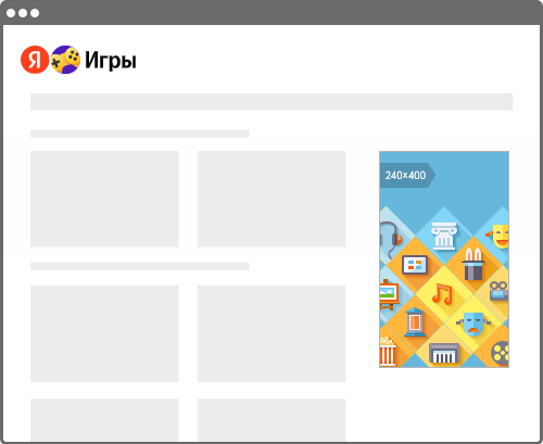
Banners in Yandex services are display ads that appear in Yandex Weather, Yandex Mail, Yandex Games, Yandex Images, Yandex Video, Yandex TV Program, Auto.ru, Yandex Translate, Kinopoisk, Yandex Music, Yandex Afisha, and on YaOS-based TVs. The banner helps capture the attention of a quality audience as they explore content, unwind, or arrange fun activities. Thanks to its prominent positioning and our extensive product reach, this format effectively establishes brand awareness among users interacting with popular Yandex services.
Ad format
You can upload banners in four sizes: 240 x 400, 300 x 600, 300 x 250, and 300 x 300. Upload your creatives in suitable formats to ensure your ads look great on all devices and attract maximum users.
Ways to work with target audience
|
Select users by category: "gender" or "gender and age". |
Geotargeting for Russian regions The option to set up geotargeting for federal regions and cities of the Russian Federation |
Select an audience with a certain lifestyle: for example, moviegoers and cinemaholics |
|
Targeting for users from the advertiser's customer base. You can expand the reach using segments of a similar audience |
Goals and segments in Yandex Metrica Serving ads to groups of users who already visited the advertiser's site or did certain actions there. |


Advertising requirements
See Requirements for banners on Yandex services.
Yandex Weather
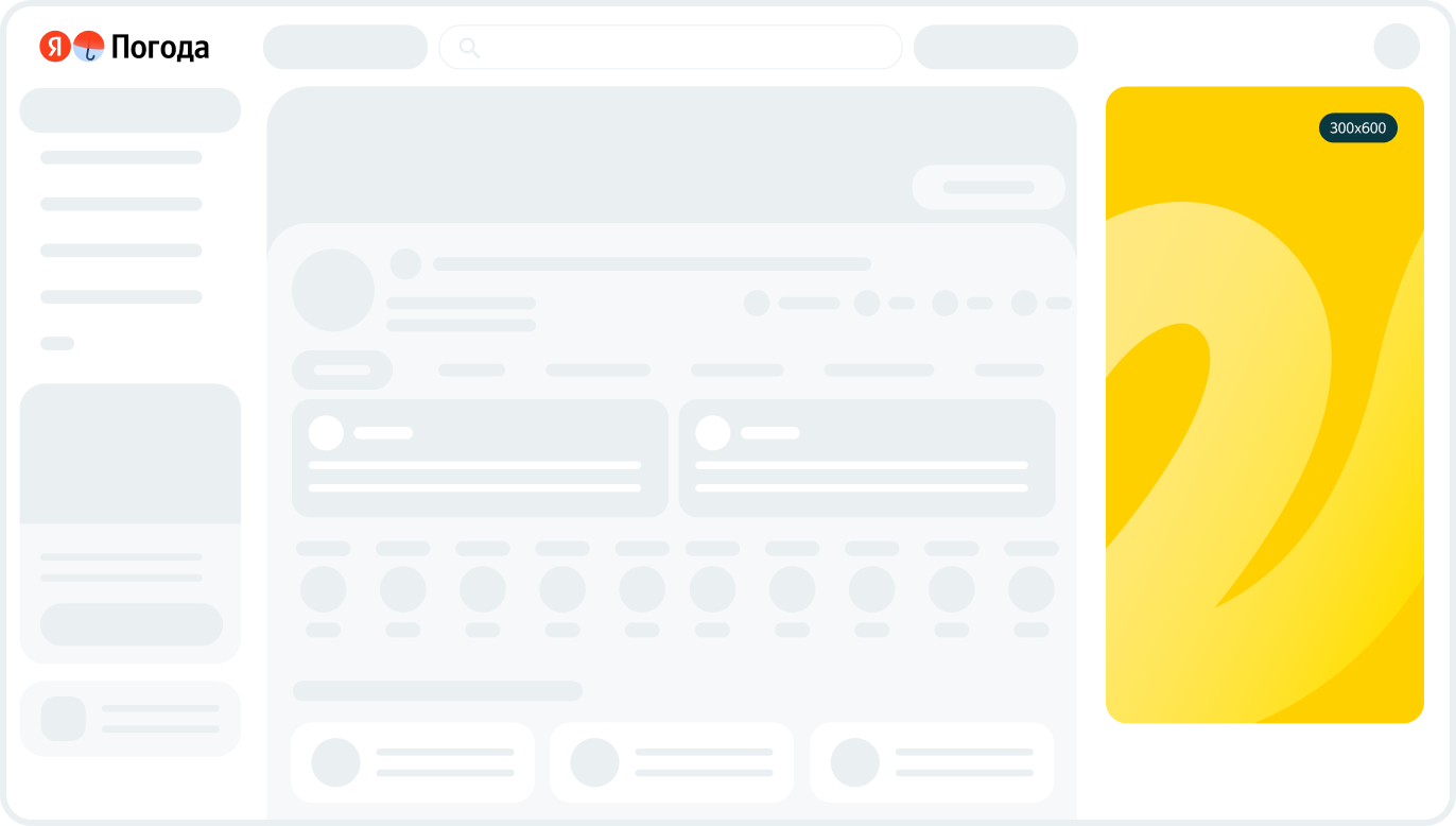
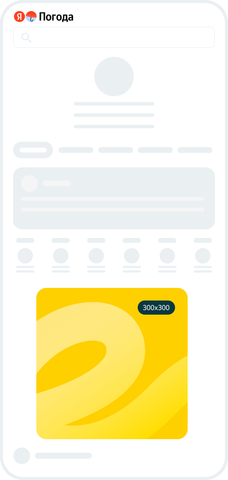
Yandex Weather is a platform used by millions of people every month to find out the weather forecast, check out the weather radar, and ultimately plan vacations, leisure and business activities.
Yandex Weather banners support targeting by weather conditions and regions in Russia and Belarus. To use these settings, contact your personal manager or the customer service department. Supported targeting settings include temperature, cloudiness, and precipitation intensity. Learn more about weather adjustments.
Ad format
You can upload banners in two sizes: 300 х 600 for a full version, and 300 х 300 for a mobile version. Upload your creatives in suitable formats to ensure your ads look great on all devices and attract maximum users.
Served on desktops.
Served on mobile devices.
Advertising requirements
See Requirements for banners on Yandex Weather.
Funtech
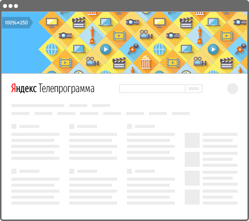
Advertising in Funtech is a packaged placement of display ads (banners) on multiple Yandex sites. Banners on these ad platforms reach a wide audience with a wide range of interests.
You can also set up Kinopoisk page branding, which is a brand-awareness ad format designed to reach movie lovers and billed per impression package.
Ad format
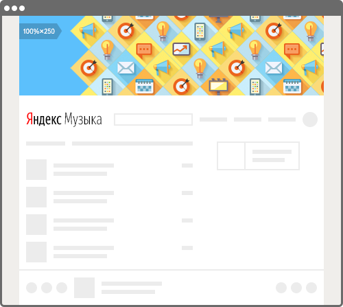
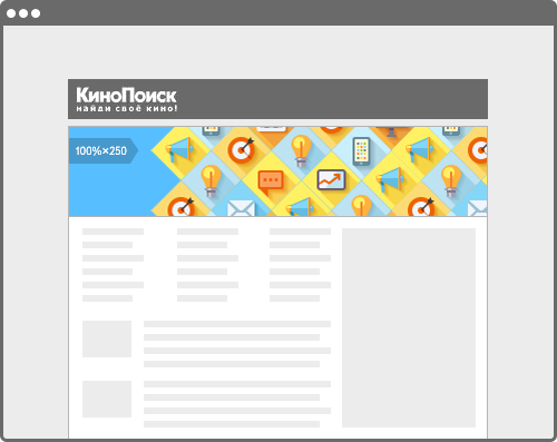
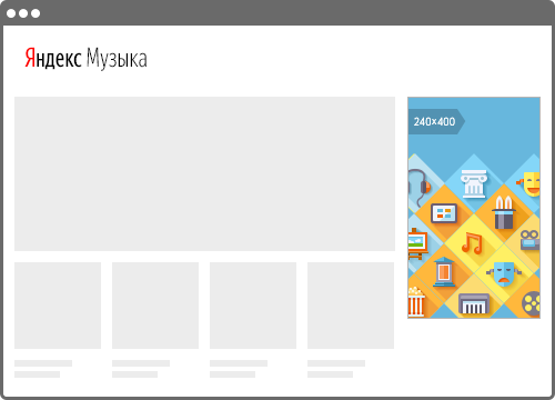
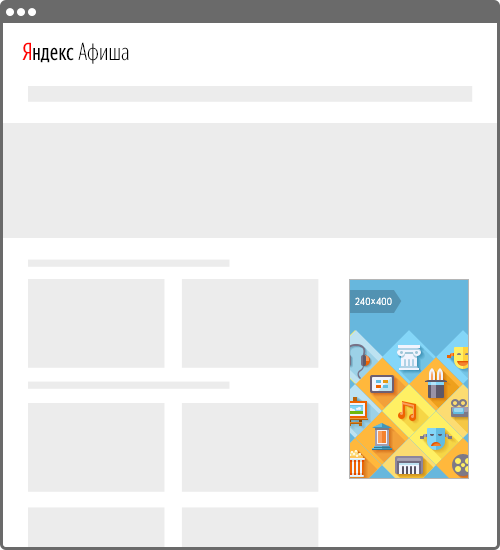
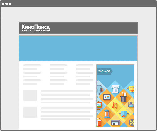
The 100% × 250 banner appears on the first screen of Yandex TV Program, Yandex Music, Yandex Afisha, and on the Kinopoisk homepage. This prime placement and the large format help your ad reach a large audience.
TV Program
Music
Yandex Afisha

Kinopoisk
Served on mobile devices.
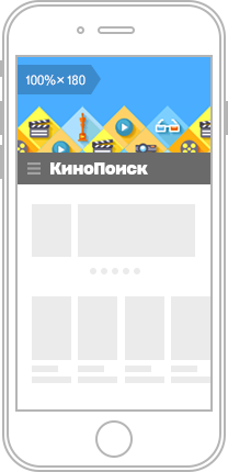
Kinopoisk
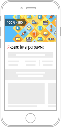
TV Program
Music
Yandex Afisha
Kinopoisk
Advertising requirements
See Requirements for Funtech banners.
For more about advertising in Funtech, see the Yandex Advertising portal.
TV billboard
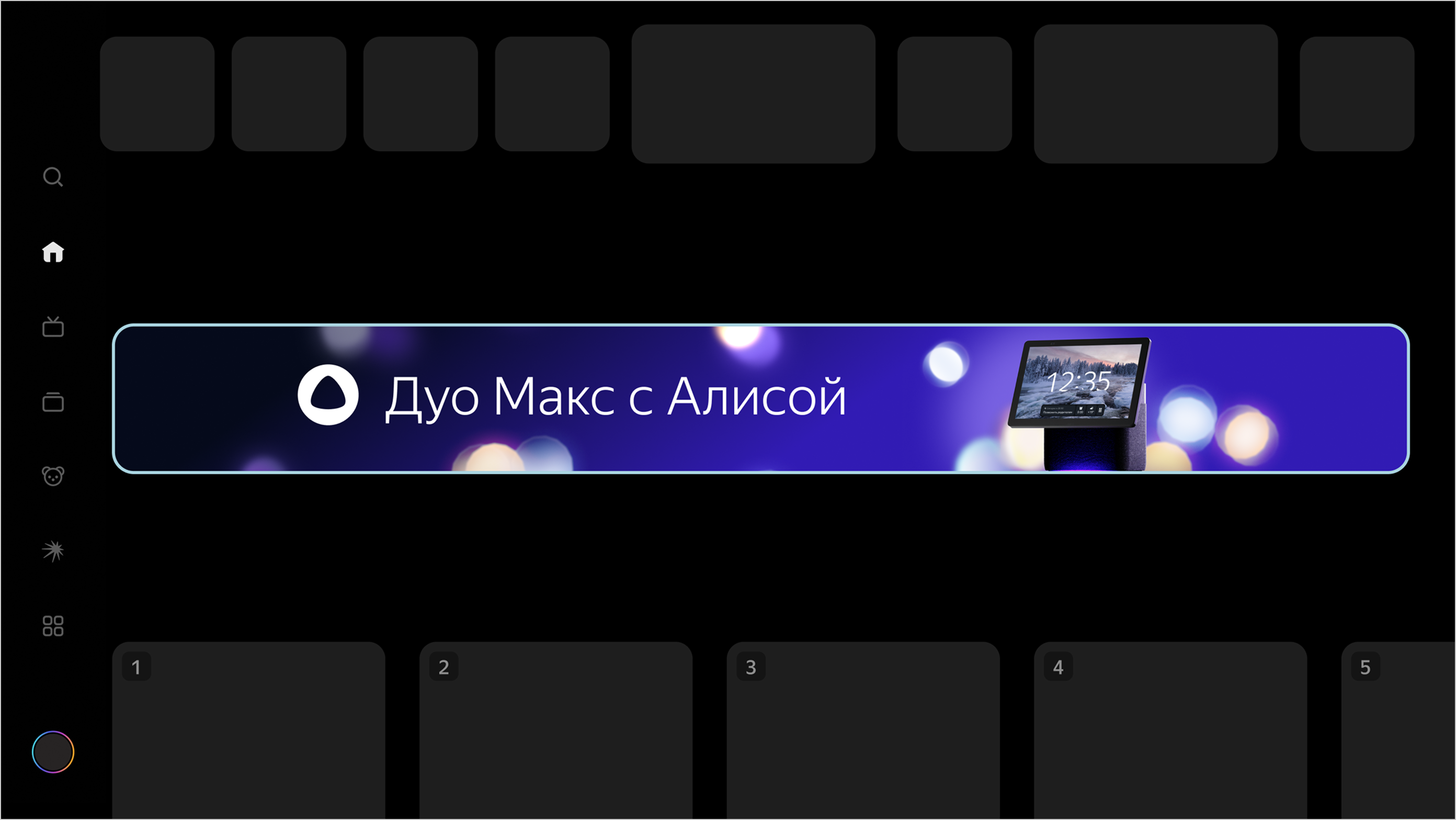
TV billboards are prominent display ads that appear alongside TV and video content on YaOS devices.
The billboard appears on the home screen when the TV is turned on, under the search bar and on the channel‑selection screen. This ensures that users see your ad when they’re relaxed or seeking entertainment.
Ad format
Billboard size: 100% × 180.
When building your creative, you can add a QR code that links to your promoted page.
Format example
Advertising requirements
See Requirements for TV billboard.
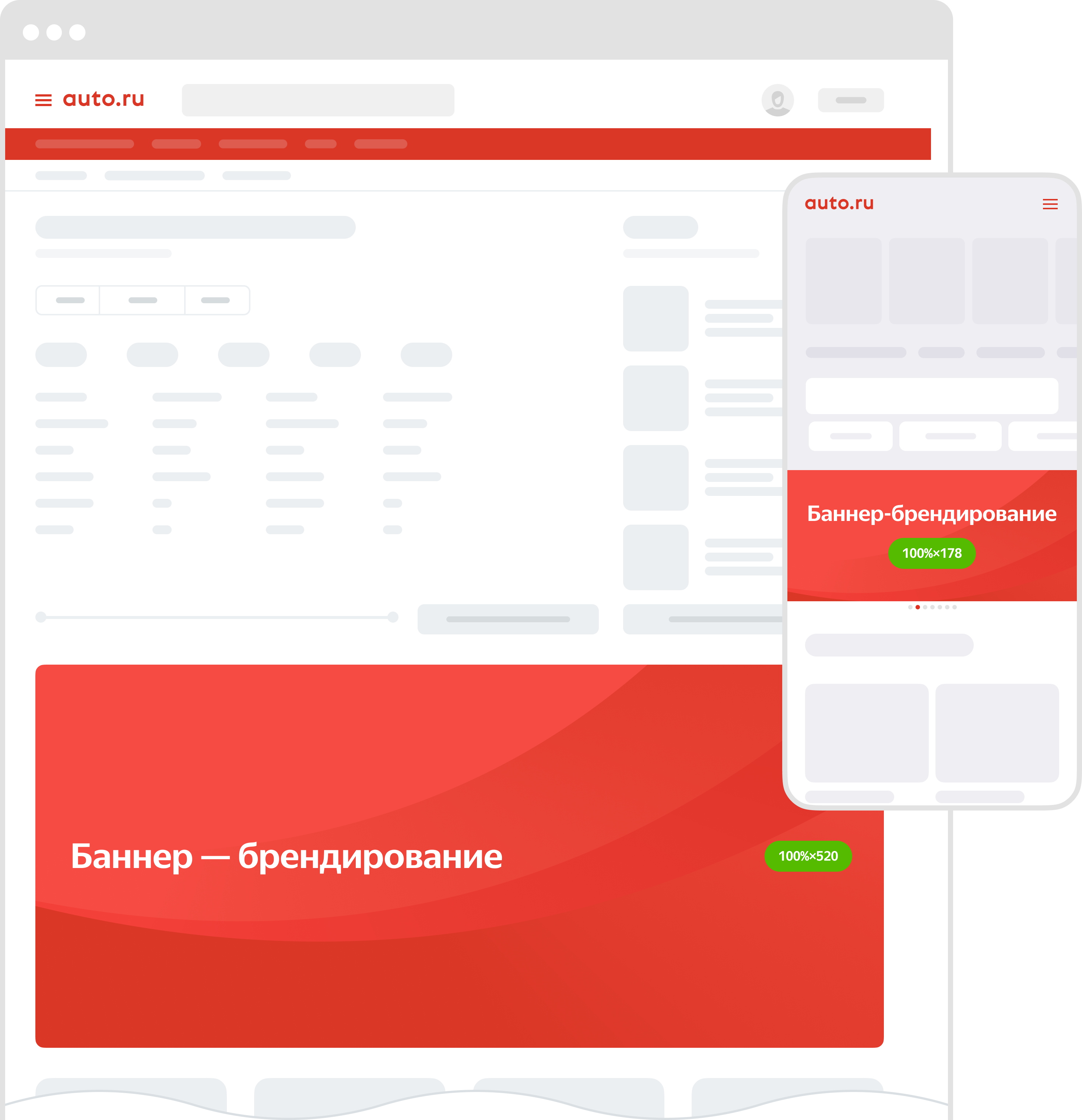
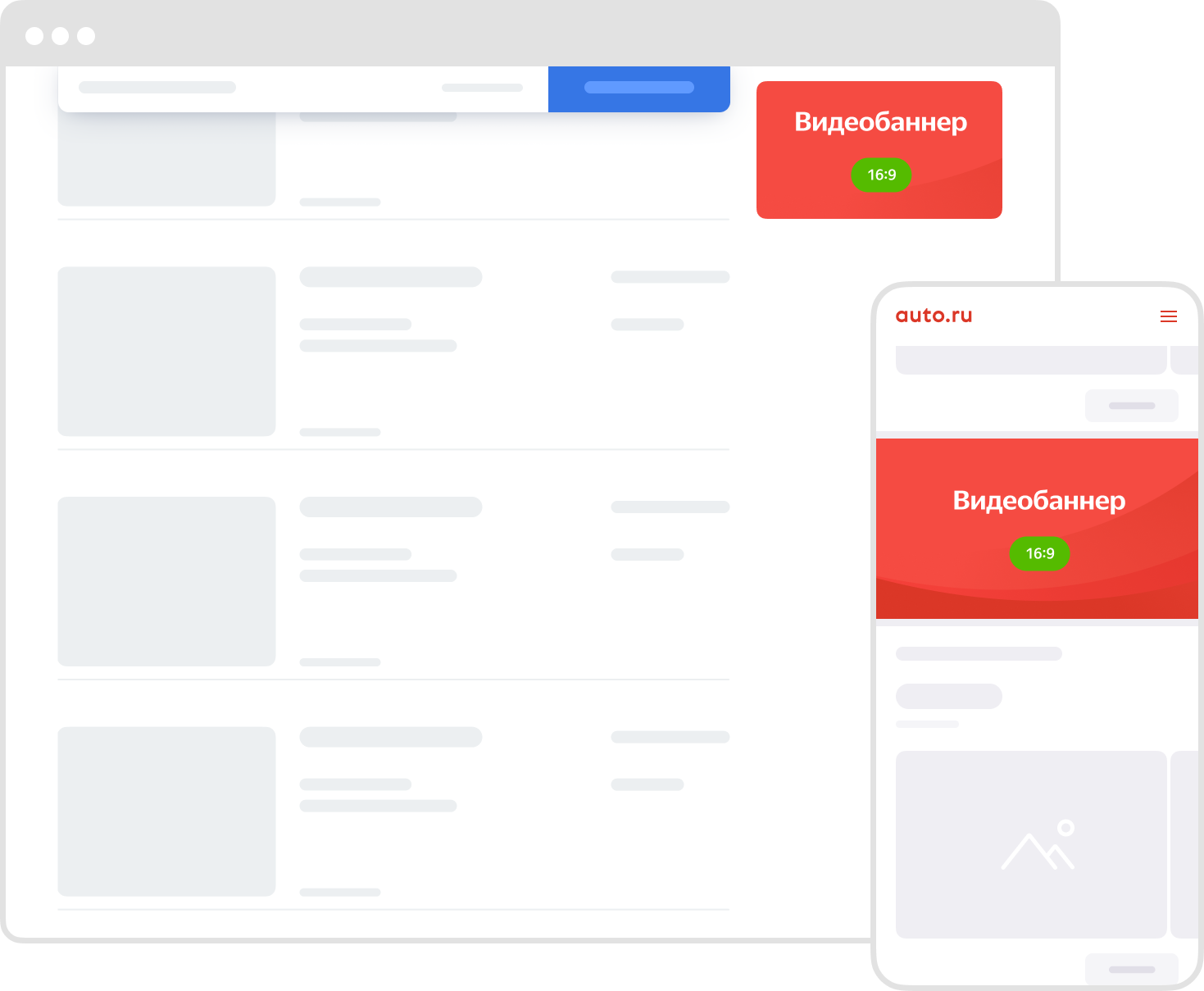
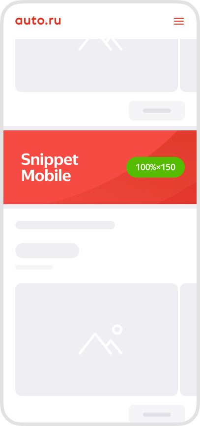
Auto.ru
Auto.ru is a leading portal for car sales in the Russian internet segment.
Thousands of motorists visit this site every day to buy or sell cars, find tires and wheels, get information about test drives, and learn the latest market news.
Ad format
You can place ads in various formats on the site: from branded pages on Auto.ru to flexibly customizable banners in various formats.
Banner branding
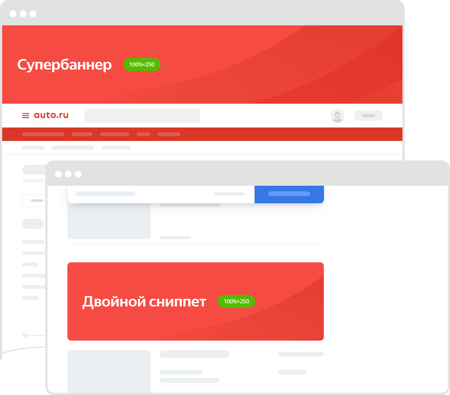
Superbanner and double snippet
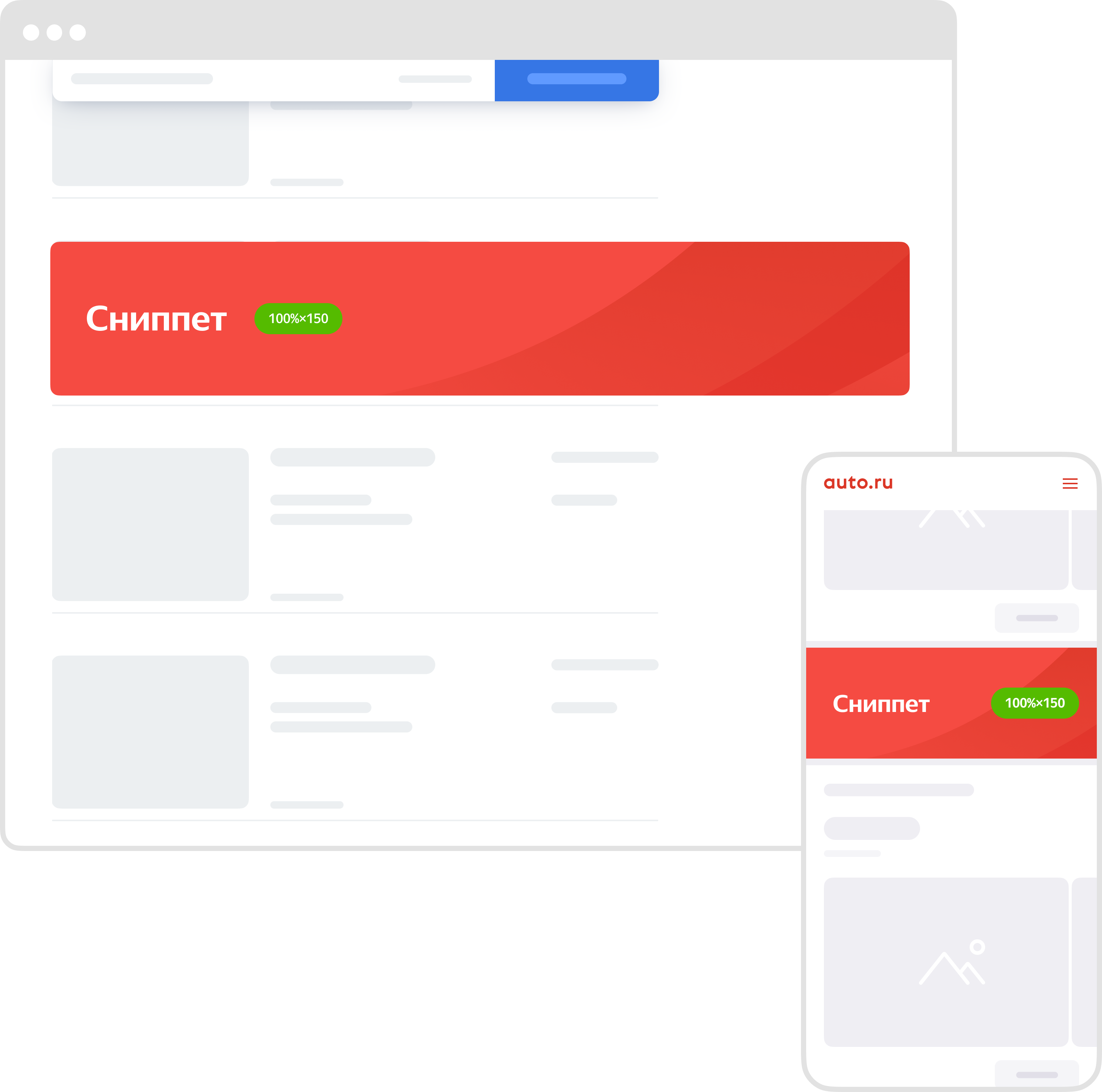
Snippet (reach)
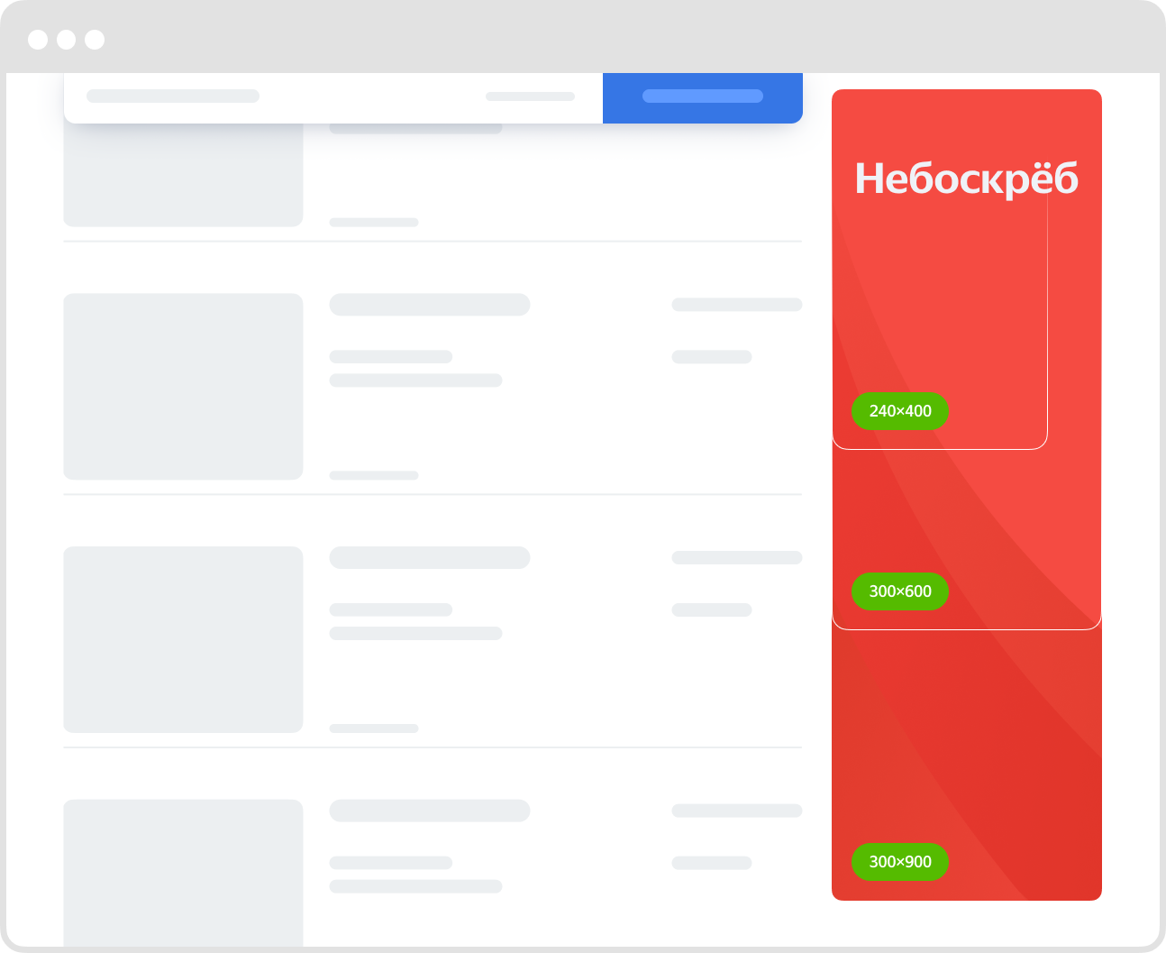
Skyscraper
Video banner
Banner in endless feed

Snippet Mobile
Advertising requirements
See Requirements for banners on Auto.ru.
For more about advertising on Auto.ru, see the Yandex Advertising portal.
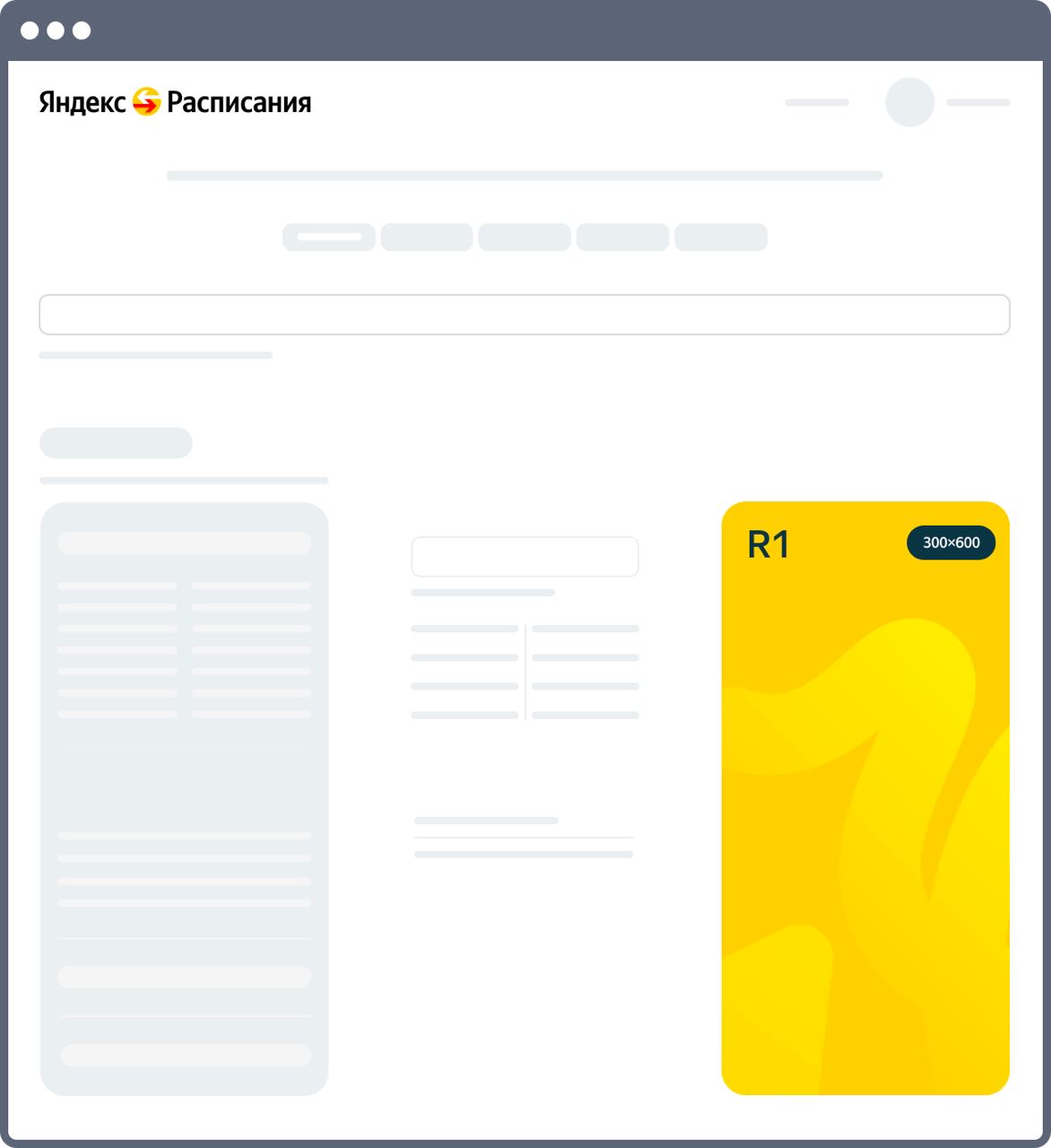
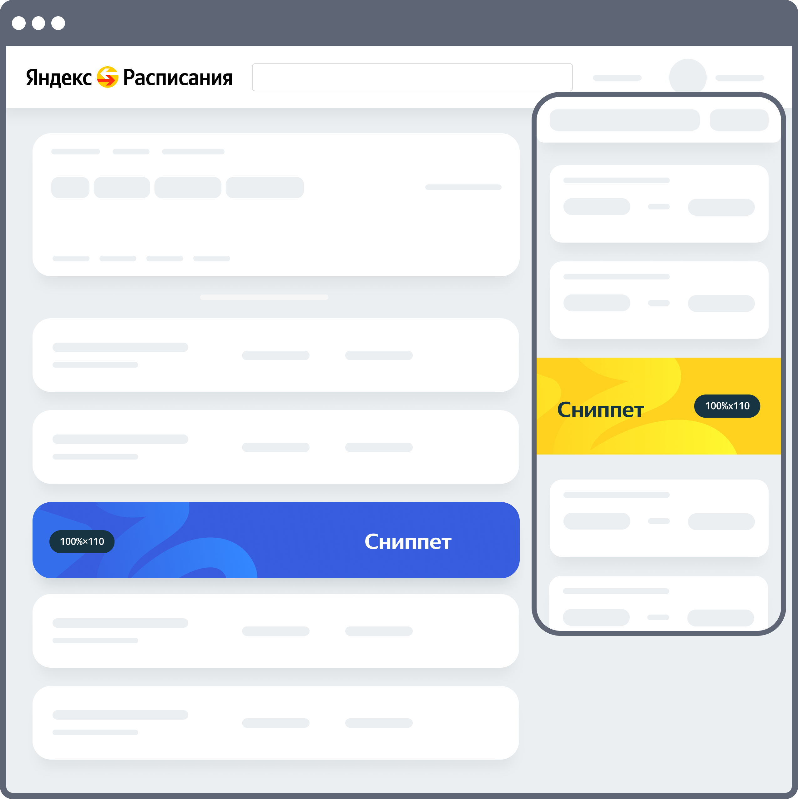
Yandex Timetables
Yandex Timetables is a service where you can find up-to-date timetables for trains, planes, buses, motor ships, and ferries. It can also tell you how to get from point A to point B, where to make a transfer, and how much your ticket will cost.
Ad format
R1
Snippet (reach)
Top Mobile

Grand Mobile

Advertising requirements
See Requirements for banners on Yandex Timetables.
For more information about advertising on Yandex Timetables, see Yandex Advertising.
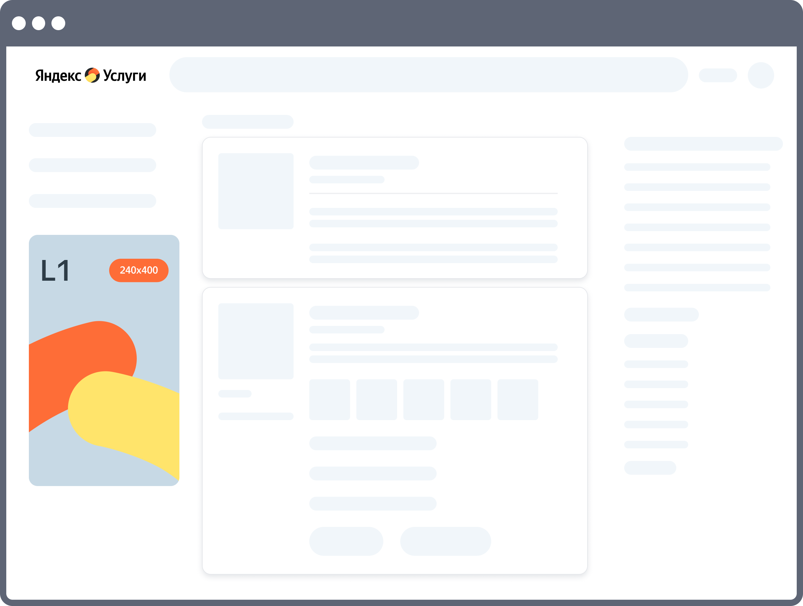
Yandex Services
Yandex Services helps you find specialists for all kinds of services one may need.
Ad format
Snippet (reach)
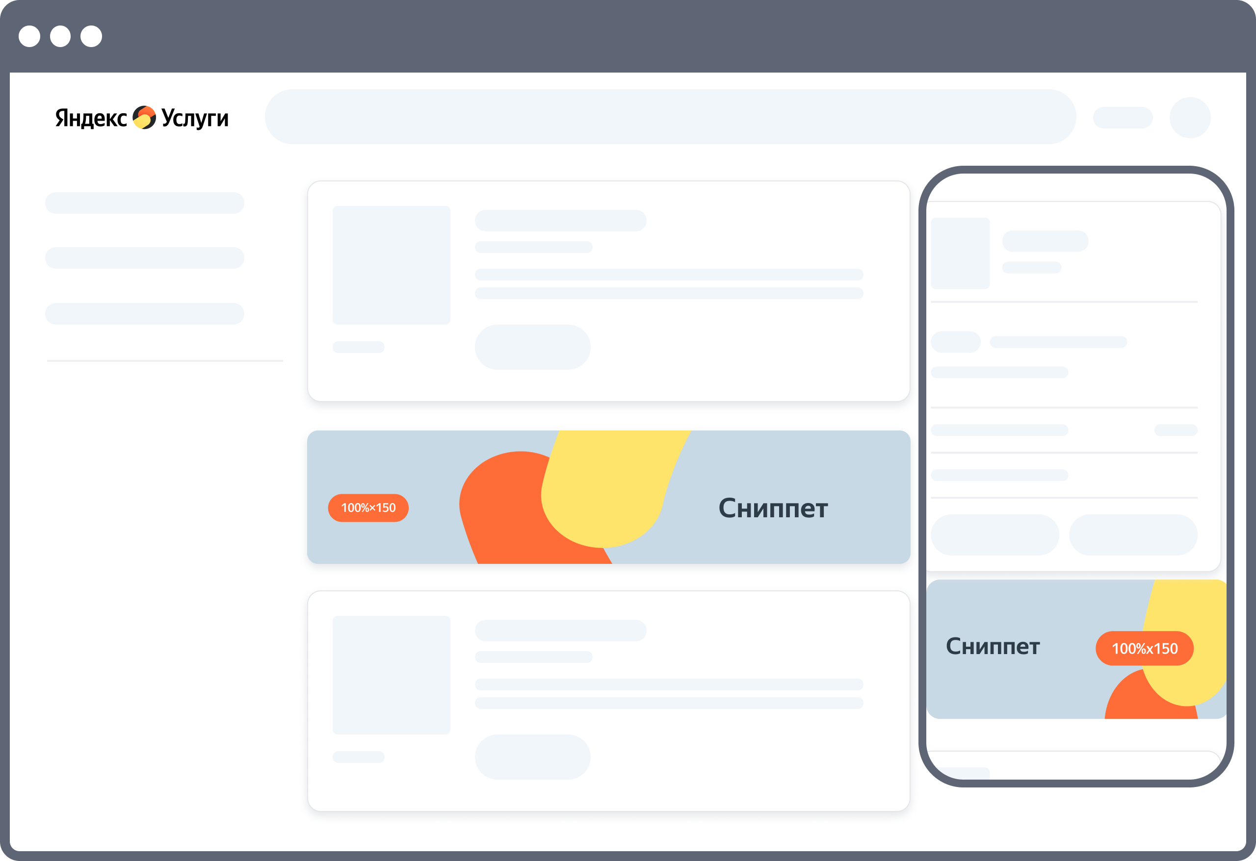
L1
Advertising requirements
See Requirements for banners on Yandex Services.
For more information about advertising on Yandex Services, see Yandex Advertising.
Have questions?
Alert
Our customer support can only assist you with campaigns linked to the username you are contacting us from. You can check your username by opening ya.ru in another browser tab. Our team can access your data only when processing your request.
Scan the QR code or tap it to follow the link.


If you select Telegram or WhatsApp, keep in mind that Yandex does not control and is not liable for how third-party messengers store your data and chat history.