Evaluate User Lifetime With Rolling Retention Reports
AppMetrica’s cohort reports now provide a new kind of user return data: in addition to regular Retention, we’ve added the popular Rolling Retention metric.
Rolling Retention shows when users lose interest in your app and allows you to calculate the churn rate. By analysing not only launches, but any other user action as well, you gain insight into what makes people return to your app, and how to extend users’ lifetime.
What’s new in AppMetrica’s Cohort Analysis reports
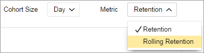
The graph settings now let you switch between Retention and Rolling Retention. Retention rates can be compared on the fly, without rebuilding the whole report from scratch. For example, if you already created a segment, the chosen metric will be immediately applied.
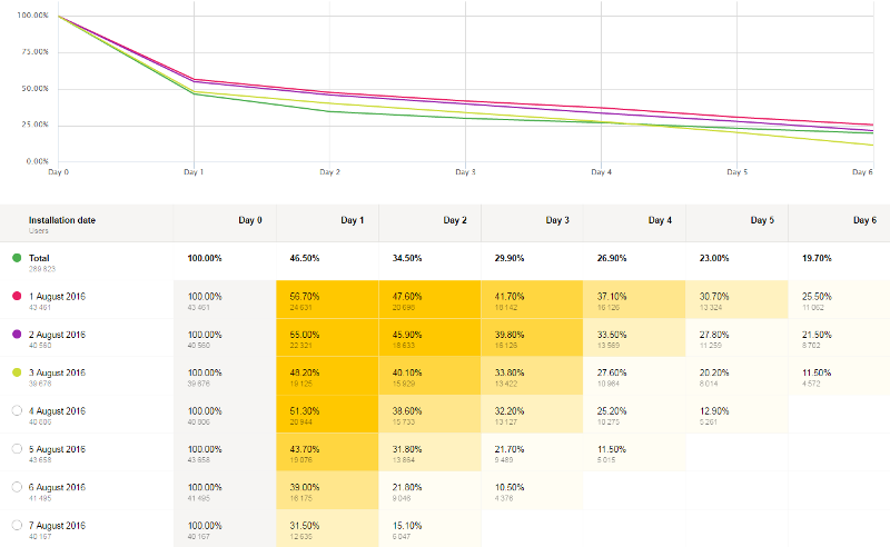
Return rates — that is, both Retention and Rolling Retention — are now calculated not only by installation date, but over an entire timeframe (“Total” line). The data is displayed in a unified graph in which the general trend with all users can be seen. Return trends in different audience segments can be compared.
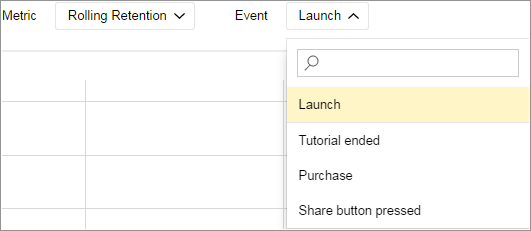
In response to developers’ requests, we have returned the ability to select any target event, and not just app launches. This option helps you evaluate how in-demand particular features are among users.
Differences between Retention and Rolling Retention
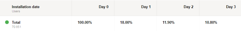
To make it clearer, let’s compare graphs of the two metrics. For the one and same sample, the Retention graphic looks like this:
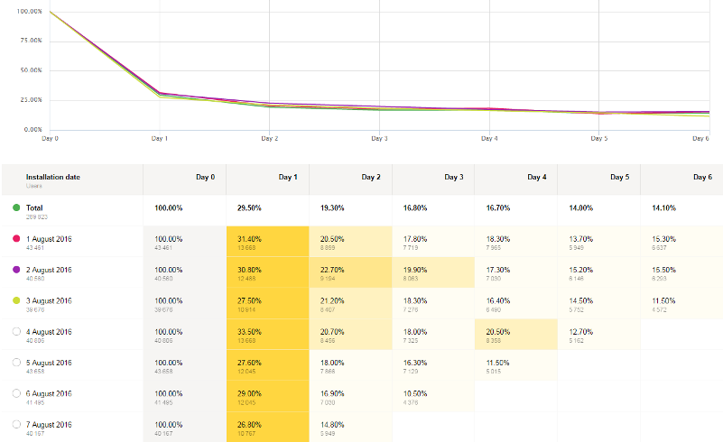
Meanwhile the Rolling Retention graph is flatter than the ordinary Retention graph: the first-day drop-off is not so sharp, and there are more users on the following days:
Traditional Retention calculates the proportion of users who returned to an app on a particular day. For example, 17% Retention on Day 3 means that 17% of those users, who installed the app on Day 0, launched it on Day 3. And on Days 1 and 2, these users are considered to be gone.
Meanwhile, with Rolling Retention a user is considered to be still “alive” on all days preceding their last launch of an app — which gives a higher return rate reading.
To understand it better, let’s look at a case example.
Let’s say that today is the sixth day since someone installed your app. The user launched the app on Day 3, and hasn’t returned since. He or she is considered active on all days from installation to next launch, ie., from Day 0 through Day 3, and from Day 4 to the current date he or she is considered to have churned.
But if a week later (on Day 13) this very same user reappears and launches your app again, his or her Rolling Retention is counted — the user joins the ranks of those active from Days 0-13.
The date range in the report doesn’t matter: for the period from August 1 through 7, a user from the August 1 cohort will be considered active even if his or her first launch of the app since installing it is in December. In this way, the metric shows the proportion of users who remembered your app after they installed it.
Factors to consider
Rolling Retention is a useful indicator of the return rate for apps that are used not very often — for example, vacation or travel planning applications. It shows the portion of your audience that doesn’t forget about your app, even with infrequent use. Classic Retention may give unduly pessimistic reports for such products.
On the other hand, standard Retention (or Return Rate) is well suited as the main return rate indicator for apps with a daily-use model — mail, browsers or games. Rolling Retention can give a too-rosy picture in these cases — but a slump in traditional Retention can give a timely warning of problems.
Both of these metrics help you better understand audience behaviour patterns. Rolling Retention tells you about retention of interest in your app, while Retention shows intensiveness of use. At the same time, Rolling Retention can indicate the audience’s point of no return and provide intelligence on user lifetime.


